FEATURES
REVIEWS EDITORIALS
THINGS TO COME
ARTICLE 10

>> Triple A: Urban Legend
>> Letter from the Editors
More...

Earlier this month, Ninth Art's editorial board convened around several bottles of wine and a hefty pile of the year's Previews to judge which comics had the most appealing, striking and successful covers in 2001. The team was joined in this task by a special guest, friend and flatmate Jamie Boardman, who spent most of the time lying on the floor muttering, but did make occasional contributions. An awful lot of wine was drunk.
ANTONY JOHNSTON: What are your first impressions of cover of the year, based on immediate recollections?
 ANDREW WHEELER: A cover that really stood out for me this year is Jessica Abel's LA PERIDA. I thought the colours were amazingly striking. The lilac blossoms on the tree - a really beautifully coloured cover.
ANTONY: That's quite a recent one, isn't it?
ANDREW: It is quite recent, but it did stand out, and it has stayed in my memory at least a month or so, damn it!
ALASDAIR WATSON: That cover didn't grab me at all. It looked to me like a splash page with a title across it, rather than a cover.
ANTONY: I thought there was too much colour. It seemed beautifully illustrated, but not very well designed. Jessica Abel has done some lovely covers, I just don't think that LA PERDIDA was necessarily one of them.
ANDREW: So what's yours?
ANTONY: In terms of standing out on the shelves, I would actually say it was the collected LAZARUS CHURCHYARD. It's so rare to see a white cover on the comic shelf.
ANDREW: It made me think slightly of the MARTHA WASHINGTON covers. There's a lot of white on those.
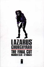 ANTONY: Yeah. Not dissimilar. Same basic design. A central fixed block, strong vertical lines, the focus is all on this one colourful figure. It really stood out, for me, on the shelves. You couldn't miss it. Alasdair?
ALASDAIR: I'm thinking, I'm thinking. I'm trying to think of covers that stood out as anything. Garth Ennis' WAR STORIES covers, with the huge logo and the photo, they were really interesting and different, and I felt it was obvious that each one was a different, self-contained piece.
ANDREW: If you saw them all on the shelf together they would all look different, but actually, seeing them one after another, I couldn't tell when a new one had come out. But then I wasn't looking that closely.
ANTONY: That's a problem we get a lot though, isn't it? I mean, look at Bradstreet's covers for PUNISHER.
ALASDAIR: Funnily enough, the other covers that stood out for me are ones where I would say, "Is that a new issue? I can't remember", and those are Andi Watson's. I know we bring him up all the time...
ANDREW: Well, you do.
ALASDAIR: I like his work, leave me alone!
ANDREW: Only because he's your brother.
ALASDAIR: No he isn't!
ANTONY: You'll laugh at me, but I think there's a similarity between Watson and Bradstreet.
ANDREW: Is it because Andi Watson always draws John Constantine leaning against a wall smoking a cigarette?
ANTONY: He's probably got that in a sketchbook hidden under his bed. No, because they both design covers really well, and they're both beautiful pieces of art, but they're too similar from month to month.
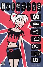 ALASDAIR: What I've noticed is that the colour changes. Watson's stuff is going to come out looking pretty similar, so he switches the colours on them. It's not working quite so well with HOPELESS SAVAGES.
ANTONY: Bradstreet should think about doing that, maybe. The covers on THE WAITING PLACE take the same tack. I think they deserve a mention, because they're always well designed.
ANDREW: I've always been impressed by their covers, they look fantastic. They really do stand out.
ANTONY: And they change colour every time. They have that same sort of... I hadn't noticed that with HOPELESS SAVAGES, actually.
ALASDAIR: HOPELESS SAVAGES is playing off the Sex Pistols stuff.
ANTONY: How do you explain the cover with the test tubes?
ALASDAIR: Test tubes? All the HOPELESS SAVAGES covers have been the Union Jack, the name over the top, and one or more of the Hopeless Savages.
ANTONY: Apart from the cover with the test tubes. [Antony holds up the cover in Previews.]
ALASDAIR: I'm going to hit you. That hasn't come out yet. That's why I don't know about it.
ANDREW: But the first three have been a bit like Frank Quitely's X-MEN covers, just focusing on one character.
ALASDAIR: I like Quitely's covers a lot.
ANTONY: I liked his Wolverine cover, with the glint over the eye. Fantastic, and very striking. There is a similarity between those, as well. Bradstreet's covers - he's a fantastic artist, but you literally can't tell one issue from another.
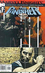 ANDREW: I've had to flick through PUNISHER to find out if it's a new one or not.
ALASDAIR: They're very good covers, but they shouldn't be sequential.
ANDREW: They have to shove the Punisher on a motorbike one month just to make sure people have some idea that it's new. There was one last year where he had a huge fish over his head. The same thing, apart from the fish. I can imagine Joe Quesada on the phone to Tim Bradstreet saying, "You've got to do something different," and Bradstreet saying, "Oh, alright, I'll shove a fish in it."
ANTONY: Maybe he was flicking through THE SANDMAN DUSTCOVERS. Dave McKean's very keen on his fish. Lots of fish.
ALASDAIR: What's McKean done in the way of covers in the last year?
ANTONY: Nothing, as far as I'm aware.
ANDREW: Although Brian Bolland channelled him for the INVISIBLES: ENTROPY IN THE UK cover.
ALASDAIR: Has McKean not done anything for the SANDMAN franchise at all?
ANTONY: Oh, yes, DEAD BOY DETECTIVES! Which, again, suffered from the same problem of similarity. I know this because I didn't pick up issue two the week it came out, because I thought it was issue one.
ALASDAIR: I think there's been an emphasis this year on making series look like series, linked thematically. With THE SANDMAN, you can tell they're by the same artist, but there's no link between them. They had to redesign the trade covers to something godawful in order to get them looking like a family. I think that's what a lot of people have gone for.
ANTONY: You should be able to do that just by using the same artist.
ALASDAIR: Except, of course, you get the same artist doing covers for ten different comics.
'I've had to flick through PUNISHER to find out if it's a new one or not.' ANTONY: True, but look at Bolland. You don't confuse a Bolland BATMAN cover with a Bolland INVISIBLES cover.
ALASDAIR: But then I don't confuse an Andi Watson SLOW NEWS DAY cover with an Andi Watson HOPELESS SAVAGES cover, and I still can't always tell them apart month to month. What makes it different is not the style of the cover, it's the content. If you're talking about someone like Dave McKean's work, how can you tell what the content is? It's very pretty, but I've got no fucking clue...
ANDREW: One artist where you can tell the issues apart, and he's very recent, is Igor Kordey. His CABLE covers - I was quite surprised when I saw his first cover on CABLE.
ALASDAIR: I remember thinking, that's not an X-book.
ANTONY: I don't think I've seen any of these, but they have been talked about a lot in the last few weeks.
ANDREW: His covers look linked, and what he's done is use strong blocks of colour.
ALASDAIR: And the logo was a complete redesign. Nothing like the previous one. And while we're talking about completely fresh relaunches, there's always X-FORCE.
ANDREW: I'm not sure those covers have really grabbed me, I have to say.
ALASDAIR: They're a good advert for what's inside.
ANTONY: They fit in very well with Allred's retro style. They had speech bubbles on the cover at one point.
ANDREW: But Allred's covers have never impressed me particularly. I never thought that he might be a great artist, because I don't think his static shots are that strong. Storytelling is his strength.
ANTONY: Although he's got a good eye for composition. Looking here at the cover to X-FORCE #1119, it's very well composed.
ANDREW: Yes, but it's very hard to appreciate with a fleeting glance.
JAMIE BOARDMAN: Just while we're on the subject of comics that reinvent themselves with each new cover, can I make a mention of PLANETARY, which does that really well.
ANTONY: We've had two issues this year, so it is eligible. And yes, it's a very good point. There's another one where you know they're part of a series, and they all look good together because they're all by the same artist, but the subject and even the style change massively from month to month.
 ALASDAIR: On the subject of Ellis' work - his covers do tend to come out pretty well.
ANDREW: Ellis is one of the few writers who seems to take a special interest in his covers.
ALASDAIR: MINISTRY OF SPACE is worth noting for the utterly played-down branding on the cover. The Image 'I' is faded, as is the MINISTRY OF SPACE logo. Look at them on the racks and all you see is the picture.
ANTONY: A few retailers complained about that, because the logo was down the bottom.
ANDREW: Marvel has been trying harder with its covers. It's not across-the-board yet, but the Fegredo covers for TANGLED WEB...
ANTONY: They were nice. Nice pictures. Were they great covers?
ANDREW: I think they were quite striking images. Painted art that looks like paintings.
ANTONY: That does make a change.
ANDREW: It's so not across the board, though. You've got Kaare Andrews doing these wonderful HULK and SPIDER-MAN covers, yet you still have to put up with some rot from Mark Bagley on THUNDERBOLTS and ULTIMATE SPIDER-MAN.
ANTONY: Do you not like Mark Bagley?
ANDREW: He's a relatively alright artist. Not a great cover artist.
ALASDAIR: Andrew Wheeler redefines the term 'faint praise'.
ANTONY: I haven't liked any of the ULTIMATE SPIDER-MAN covers that I've seen, but that's more because I didn't like the style, and didn't think they were well designed, rather than not liking the art.
ANDREW: Where Marvel's new cover policy is going wrong is with covers by David Mack that bear no resemblance to the stories inside.
ANTONY: Or all the ones by Greg Horn.
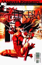 ANDREW: The Greg Horn ones are just appalling. The David Mack ones look fantastic, but when he was doing the covers for the Bob Gale run, which was a very old-school story, they sat very at odds with the content. Greg Horn...
ANTONY: I've seen some great artwork from Greg Horn. I'd like to think he's just rushing these ELEKTRA covers, but... this one...
ANDREW: Melons in a bag.
ALASDAIR: Dear God. This is why I don't pay attention to Previews. It's full of covers.
JAMIE: I think we should single out the ULTIMATE line, because the cover design strikes me as being dreadfully dull. So much dead space.
ANDREW: Yet they have a unified design to make them stand apart.
ANTONY: I think the trade dress does make them stand apart, but the covers themselves don't grab me at all.
ANDREW: TEAM-UP has had some good covers, like Jim Mahfood and Bill Sienkiewicz.
ALASDAIR: Sienkewicz's cover to FURY #2 made me laugh out loud. Nick Fury in the zimmer frame with the machine guns.
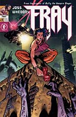 ANTONY: Sienkiewicz is another one like McKean, he's actually a designer rather than an artist. I think that makes a difference. A lot of cover artist could benefit from going on a basic design course. FRAY #1, there's a cover I thought was rather good. Something about it caught my eye. I think it's a design thing, the strong diagonal lines forcing your eye towards the central figure, and she's very well drawn.
ANDREW: It's the classic building cornice cover. There should be a collection.
ANTONY: They'd all be BATMAN, wouldn't they?
ALASDAIR: SPIDER-MAN.
ANDREW: EXCALIBUR.
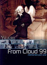
ALASDAIR: Another honourable mention; FROM CLOUD 99.
ANDREW: That was a white-haired man and lots of rusty brown machinery, wasn't it?
ALASDAIR: Humanoids covers are usually lovely painted pieces. It has a horizontal element containing scenes from inside the book.
ANDREW: Like a trailer.
 ANTONY: Can you imagine if they put a trailer for Elektra on the cover? Chuck Austen's art next to Greg Horn's paintings?
ANDREW: Two mediocre artists for the price of...
ANTONY: None, because if it's on the cover you wouldn't buy it.
ALASDAIR: LONE WOLF & CUB deserves a mention as well. Finally, comics that are nicely sized and nicely uniform.
ANDREW: You should have bought the Marvel Backpacks series.
ALASDAIR: Oh shut up.
ANTONY: The thing about the LONE WOLF & CUB covers is that more than half of it is typography, which is just design. The only thing that changes is the words saying the title of the chapter. The actual picture was pretty horrible, especially when Frank Miller was doing it.
ANDREW: Ah, MAGIC PICKLE #1, I did like that cover. Nice colouring, a striking, simple cover.
ANTONY: It stands out because there's so little trade dress. It looks more like a book cover.
ALASDAIR: Another thing about MINISTRY OF SPACE is that it moved the trade dress to the back cover.
ANTONY: As did LAZARUS CHURCHYARD. RED STAR, they had some nice covers, didn't they? Jamie is nodding. I never got around to reading it, but the covers are nice. The OBERGEIST covers are a perfect example of brilliant artwork, not really striking covers.
ALASDAIR: They were too chaotic and cluttered, so they didn't stand out. There was no single strong image.
ANTONY: Too many colours, as well. They looked too much like panels. Which is a shame, because they were beautiful works of art.
JAMIE: I'm just thinking about what you're saying about covers being more like standard fiction, what do you think of the POWERS covers when they mimicked magazine covers for one story arc?
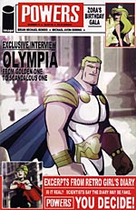 ANTONY: POWERS has had some excellent covers, mainly due to Mike Avon Oeming's striking artwork. He doesn't have a lot of detail.
ANDREW: I'm not as impressed with his covers as you are. I think they're occasionally a bit... they lack depth. The one recently with the woman's crossed legs and the two of them coming in through the door, I didn't think that was too strong. Because his art is generally flat, that can be a problem.
ANTONY: I think the colouring is flat, although it's meant to be.
ANDREW: In the story it works. On the covers it's not so effective. They can be quite garish, too, sometimes.
ANTONY: The magazine format covers I think worked in terms of making it stand out on the shelves. In terms of actual magazine cover design, they were appalling, but I think they were designed to look like those horrible tabloid celebrity magazines, and those don't have very well designed covers either.
ANDREW: On the subject of pastiche, one artist who gets pastiched a lot is Alfons Mucha. There are a lot of people who try to do his style of French art nouveau, turn of the century stuff. Women with curlicues of hair and dials behind them. A lot of Adam Hughes's WONDER WOMAN covers do that. Dawn Brown on LITTLE RED HOT. A lot of people try to do it, very few succeed. Artists like Mucha and Norman Rockwell knew how to design single image art. Posters, covers. That's why you get a lot of tributes to them. It's a shame that people don't take their lessons on board in order to do something new.
ANTONY: Rather than just copying the style?
ANDREW: Yes. Much as I love to see a cover done in the style of The Evening Post, I'd like to think you didn't have to do a pastiche of The Evening Post in order to do a good cover.
JAMIE: Another series of covers, although I don't read the singles, that have impressed me a lot, is 100 BULLETS. Very striking.
ANTONY: Yes, I'd say that, apart from Bolland, Dave Johnson is one of the best cover artists going.
ANDREW: I would put him ahead of Bolland, because I think his design strength is greater.
ANTONY: I don't know if I would agree with that. I think Bolland's design strength is very good. His weakness is that, by his own admission, he's a bit lazy. When people ask for a Bolland cover, they get a Bolland cover. Whereas Johnson I think is a bit more keen to prove himself.
ANDREW: One thing DC's been doing right this year is BATMAN covers. Bolland is doing one series, Johnson is doing another - Greg Rucka's DETECTIVE COMICS. And the Johnson ones quite aren't as good as his 100 BULLETS covers, but they're very strong. I don't like the new Batman trade dress, though. I think it's horrible.
ANTONY: The one designed by Chip Kidd? I really like that. Everything going along the horizontal.
ANDREW: It may just be the little pointy-eared Batman mask that puts me off. I think it looks atrocious. And the Bolland covers do not stand out as well as the Johnson covers.
ANTONY: I read an interview with Johnson in the Comics Journal a while ago, and he said he doesn't feel very confident about what he can do, and that's why you get all these bizarre cover ideas coming out of 100 BULLETS just because he's trying something new.
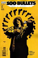 ANDREW: Rosettes of guns. Cars that haven't been coloured in. His covers have pretty much all worked, apart from the Charles Manson cover.
ANTONY: The covers on 100 BULLETS have got more and more risque. Dizzy is wearing less and less clothes until finally, last month, she's nekkid!
ALASDAIR: All issue long?
ANTONY: Just on the cover.
ANDREW: Bill Jemas is selling the all-naked variant.
ALASDAIR: I don't pay much attention to covers. I generally know ahead of time whether I want to pick up a series.
ANTONY: Do you not browse the bookshelves?
ALASDAIR: Only to see what's come out. You walk into the store and it's all one dreadful mass of colour. Too much going on.
ANTONY: That's precisely why the good covers stand out.
ALASDAIR: I have The Shipping Forecast on my PDA, so I use that. I just pull that up.
ANTONY: A fine innovation! But I get all my regular stuff on my pull list and then I go across the shelves looking to see if anything catches my eye. Do you not do that at all?
ALASDAIR: No.
ANDREW: Do you never see a nice cover and think to have a look through it?
ALASDAIR: No. My natural assumption is that the cover artist will not be the same as the interior artist.
ANTONY: But that's not the issue, surely? 100 BULLETS, Dave Johnson is not the interior artist, but it shows that some thought has gone into it.
ANDREW: A good cover can be a hallmark of quality. I know Com.X has this policy, don't put a different artist on the cover than on the interior and I can see where they're coming from, but I don't necessarily agree.
ANTONY: I think the difference there is that they started out as a graphic design group, so their covers tend to be quite good anyway, because they're standing over the artist's shoulder going, "do this". I know, I've seen it happen.
ALASDAIR: I don't scan the shelves looking for covers. I might look for titles, but I don't look for covers.
JAMIE: Can we award a special prize for pretty but utterly, utterly pointless cover change of the decade? TRANSMET, with Moebius. Very nice looking, but absolutely adds nothing to that book for me.
ALASDAIR: The cover of TRANSMET changes every three issues anyway.
ANDREW: It's a sign of Warren's hands-on approach to cover design, he's very demanding and very specific about who he gets on the covers. And it's a nice idea.
ALASDAIR: There's only one of... how do you pronounce his name?
ANDREW: Jean Giraud.
![]() ALASDAIR: There's only one of his covers that I thought was a nice cover, and that was the one with the grey Spider lying there with a cigarette in his mouth. The other ones didn't work so well.
ALASDAIR: There's only one of his covers that I thought was a nice cover, and that was the one with the grey Spider lying there with a cigarette in his mouth. The other ones didn't work so well.
ANTONY: Geof Darrow was I believe initially meant to do all the TRANSMET covers. Certainly the first run. The poster said 'covers by Geof Darrow'.
ANDREW: And then THE MATRIX got him.
ANTONY: But having the covers change, especially when tending to work on three-issue arcs, or six issues, wasn't a bad idea.
ANDREW: I think it makes sense, but I think it's almost too inconsistent. Why make your covers a showcase for artists rather than a showcase for the story?
ANTONY: It wouldn't surprise me if it's a slightly commercial decision as well. People who like Moebius may never have picked up an issue of TRANSMET, but they'll recognise a Moebius painting when they see one.
ALASDAIR: The Cassaday covers for TRANSMET were also this year. Those were lovely, lovely things.
ANTONY: I actually didn't think they were all that great. They were OK, but not as good as his PLANETARY covers.
ANDREW: Look here. That's a Brian Bolland GOTHAM KNIGHTS cover. It's all right. That's a Dave Johnson BATMAN cover.
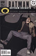 ANTONY: Yeah, OK. Point taken. It's not Bolland at his best. I didn't actually realise Johnson was doing these, but I have noticed them in the store.
ANDREW: They're very good covers. They remind me of TERMINAL CITY covers.
ANTONY: We've talked about most of the maisntream, what about the others? We have to mention CrossGen.
ALASDAIR: There's not much to say about their covers. They blend in.
ANDREW: They are very generic covers. There's no real sense of design there. They're your classic panel-from-the-book. A scene from the story. I much prefer representative covers than covers that show a moment from the book.
ANTONY: Why is that?
ANDREW: To me, if it's representative, it allows for more of a design sense. If it's a scene from the story it looks cluttered, and it's unnecessary. That kind of classic FANTASTIC FOUR cover with everyone being attacked by the underground monster, and Sue screaming, "Oh, but I feel so helpless, Reed". It's got a certain charm, if used ironically, but I like covers to look like a cover, not a panel of the story. CODENAME: KNOCKOUT covers by Joe Chiodo are fantastic. Shame about the book. And Frank Cho's covers for LIBERTY MEADOWS are wonderful, apart from the ones where it's a frog pulling down a woman's pants, or something.
ANTONY: In terms of execution they're very well done indeed. I think... I'm loathe to give anyone advice for free...
ANDREW: Because, of course, people come to you for advice.
ANTONY: People trek half way across the world to come to my cave.
ANDREW: You're confusing yourself with Osama again.
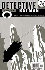
ANTONY: Oh yes, sorry. Where's my beard? Alan Moore borrowed it. I really think CrossGen could do with some colour coding, and getting someone who is a graphic designer, and I mean that as no disrespect to the artists, because they're lovely pieces of art, but they don't really know how to do covers. One of the things about BATMAN ... which one uses only two colours for the interiors?
ANDREW: DETECTIVE COMICS.
ANTONY: A fantastic idea. I think CrossGen could do something like that for their covers, because they've got so many titles, which, because of these one-word names, are fairly easily confused to someone who doesn't read them...
ANDREW: That'll be us, then. Whoops.
ANTONY: Even if it was making the MYSTIC logo always one colour, and no other book has that colour logo, for example.
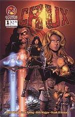 ANDREW: That CRUX logo is hideous, isn't it?
ALASDAIR: The CROTCH logo?
ANDREW: CROTCH! CrossGen is really going for the lowest common denominator with that one. CROTCH COMICS! Where do they put the sigil?
ANTONY: OK, so who is producing the best covers, and is it done to company or artist?
ANDREW: The company doing the best covers consistently is... oh. There isn't one.
ANTONY: I really don't think there is, no.
ANDREW: I was thinking Marvel, but... no.
ANTONY: Worth noting that this is being recorded before DC's Full Coverage event, with the logos incorporated into the covers.
ALASDAIR: They're pretty awful anyway.
ANTONY: I think it's nice of them to make an effort, though.
ALASDAIR: I don't think DC has topped it's head month. They looked lovely.
ANTONY: Characters giving each other blowjobs. Sold very well.
ALASDAIR: For that one month, they did away with standard logos and focused on headshots of the characters.
ANTONY: The issue I have with Full Coverage month is, as a few other people have pointed out, it's kind of a shame that something like this has to be done specially.
ALASDAIR: Our special event this month: We're going to try to have nice covers!
ANTONY: It does seem the best covers are down to individual artists, rather than companies.
'My natural assumption is that the cover artist will not be the interior artist.' JAMIE: How about AIT/PlanetLar? Books that look like books. It makes such a difference.
ANTONY: That's probably down to the fact that most of their covers are done by Brian Wood, who is a graphic designer.
ANDREW: With Marvel, the thing I've realised is the good covers, the covers where they've made an effort, are the ones where they've made an effort to reinvent the book. The books that still look crap, and have old-fashioned covers, are the ones they've not got around to changing.
ANTONY: Do you suppose that's due to lack of resources?
ANDREW: They've said they can't relaunch everything at once, so they're staggering it, so fair enough. But there's still a striking difference between the new and the old.
JAMIE: Look at Marvel's nominally biggest book this year, ORIGIN. The covers are dull, I thought. Pretty, but dull.
ANTONY: But striking, and the logo was nice, there was no trade dress. They have at least tried something different. It's like a movie feel. They look like the covers of books.
ANDREW: DC overall are very much the same. A few good covers where they've made an effort, and a lot of generic rubbish. But there isn't one publisher who is doing great covers.
ANTONY: People like Oni and PlanetLar are making more of a concerted effort to make good covers than, say, DC and Marvel. But they still don't always succeed. How about Avatar?
ANDREW: Love those covers. Especially the little black rectangles.
ANTONY: In terms of marketing to your audience, I don't think they put a foot wrong. Or an oozing tentacle, for that matter. So it is down to artist.
ANDREW: And who are the artists?
 ANTONY: Dave Johnson. For continual experimentation...
ALASDAIR: And services to comics.
ANDREW: We dub thee Sir Dave.
ALASDAIR: Brian Bolland.
ANDREW: Not making as much effort as he should be. Bad Bolland.
ALASDAIR: Not making the effort, but it's Brian Bolland. Even his BATMAN covers are very striking.
ANTONY: Even an average Bolland is still better than most other people.
JAMIE: John Cassaday. His PLANETARY covers are bloody good. Just because he manages to reinvent the look of the thing believably and cogently with each issue, and you're always drawn into it.
ANTONY: Andrew, who do you vote for?
ANDREW: Probably Dave Johnson as well. His BATMAN covers clinch the deal. Very noir, very retro, very... all these buzzwords. Morrisonesque-widescreen-minimalist-iconic.
ALASDAIR: Post-superheroic.
ANDREW: Marxist.
JAMIE: It's funny that we say there's no one company, but we've all gone for DC artists.
ANDREW: My second place would have gone to David Mack, though. If only his covers matched the stories. They're works of art. Oh, and Fegredo's LUCIFER covers deserve a mention.
ANTONY: They were nice. I wouldn't say they were necessarily eyecatching. They were great Vertigo covers.
JAMIE: With all the baggage that entails.
ANTONY: Exactly. They didn't throw themselves off the shelves
ANDREW: I don't want them jumping off the shelves. You'd have to catch them in a basket.
ANTONY: "Come on! Jump in!"
ANDREW: "Good comics only please!"
ALASDAIR: "Get back, SIGIL!"
JAMIE: You'd be batting swarms of HELLSPAWN away with a tennis racket...
ANDREW: I'm ending this recording now.

This article is Ideological Freeware. The author grants permission for its reproduction and redistribution by private individuals on condition that the author and source of the article are clearly shown, no charge is made, and the whole article is reproduced intact, including this notice.
All contents
©2001-5