FEATURES
REVIEWS EDITORIALS
THINGS TO COME
ARTICLE 10

>> Triple A: Urban Legend
>> Letter from the Editors
More...

ANDREW WHEELER: Last year, in Covers Of The Year 2001, we essentially concluded that DC has all the best covers. In the same way that the devil has all the best musicians. This year, it looks like they still do.
ANTONY JOHNSTON: It's sad to say, isn't it?
WHEELER: Well, it's good for them.
ALASDAIR WATSON: Many of the mainstream publishers are leaving them standing creatively, though. Marvel is leaving DC standing in terms of getting the talent and revitalising the line. It has been for the past two years. All DC has got over Marvel is that its product looks a bit nicer. And that's only until you open the cover.
WHEELER: It's much more pleasant going through the DC section of Previews than any of the others.
WATSON: Yes. It's the least spirit-crushingly painful one of them. And that's not saying it's not spirit-crushingly painful.
JOHNSTON: It's certainly a lot less offensive than a lot of the other stuff, both in terms of design sensibility and puerility.
WHEELER: The bleakest of the Big Four for me by quite some distance was Image.
 WATSON: Yeah, I kind of just blurred on that one. "Oh look, Image! Tits!" So
nothing's changed, then? I know there was that brief period when it looked like
things were going to, but they didn't.
WATSON: Yeah, I kind of just blurred on that one. "Oh look, Image! Tits!" So
nothing's changed, then? I know there was that brief period when it looked like
things were going to, but they didn't.
WHEELER: Even their respectable books don't have great covers. POWERS does not have great cover design. AGE OF BRONZE is probably the most attractive book in the line.
WATSON: POWERS started out being distinctive and attractive, but now it's just another POWERS cover. And I know that's the point, it's a branding exercise, but it just looks like more of the same.
JOHNSTON: The majority of POWERS covers over the last year, if not longer, are actually homages or parodies of album covers. Which is good; they're picking albums covers that are well designed. But it's getting a bit old.
 WATSON: Thinking about covers that are 'after' something else, PROMETHEA for the
last ten or twelve issues, all the covers have been after a particular artist.
WATSON: Thinking about covers that are 'after' something else, PROMETHEA for the
last ten or twelve issues, all the covers have been after a particular artist.
WHEELER: And a really diverse range of artists. Escher, Mucha, Waterhouse. Even a black light artist. JH Williams' covers are really beautiful.
JOHNSTON: Again, a DC book.
WATSON: Don't say that! Alan Moore will get the hump.
JOHNSTON: I've got a list here of good covers, and very few of them aren't DC books.
WHEELER: You get some lovely covers across some titles that I've never read and never cared to read at DC. Books like DEADMAN, with a series of Mike Mignola covers. P Craig Russell doing SPECTRE covers. Adam Hughes on WONDER WOMAN. They form wonderful galleries.
 WATSON: I was flicking through Previews and I noticed BIRDS OF PREY and
thought, 'gosh, that's nice looking'. I have no urge to buy it whatsoever.
WATSON: I was flicking through Previews and I noticed BIRDS OF PREY and
thought, 'gosh, that's nice looking'. I have no urge to buy it whatsoever.
WHEELER: I don't always like Phil Noto's BIRDS OF PREY covers, but they're very interesting colour choices. They're always distinctive.
JOHNSTON: WILDCATS 3.0 Again, no interest in the content, but the covers are really nice.
WATSON: While we're talking about Joe Casey comics; AUTOMATIC KAFKA. I'm not going to say the covers were nice, because I think they were a bit... 'enh'. What interested me about them was the typography, the logo. It's like nothing else. They hide it. They pretend it's not there.
 JOHNSTON: Yeah, the illustrations aren't fantastic, but the composition and the
typography are lovely, and it is quite brave to have the typography that small.
JOHNSTON: Yeah, the illustrations aren't fantastic, but the composition and the
typography are lovely, and it is quite brave to have the typography that small.
WATSON: You're not going to see it at all in your average comics rack.
JOHNSTON: No, you're just going to have to know what it is because it so obviously looks like Ashley Wood. You'll see a coffee ring and think, "Oh, it's Ashley Wood".
WATSON: Another series I want to mention is the second HOPELESS SAVAGES. You would not have picked Terry Dodson to follow Andi Watson, based on the content of HOPELESS SAVAGES, but it worked brilliantly.
 WHEELER: I've always liked the Dodsons. Although people criticise them for
cheesecake - and sure, it's there in the other covers that they've done this
year, like BLACK CAT and HARLEY QUINN, and there's even an element of it in
HOPELESS SAVAGES - I think they're such lovely, clear covers. Cheesecake
pin-ups are an art form of sorts, and they're very good at it.
WHEELER: I've always liked the Dodsons. Although people criticise them for
cheesecake - and sure, it's there in the other covers that they've done this
year, like BLACK CAT and HARLEY QUINN, and there's even an element of it in
HOPELESS SAVAGES - I think they're such lovely, clear covers. Cheesecake
pin-ups are an art form of sorts, and they're very good at it.
JOHNSTON: POPGUN WAR. I want to give that an honourable mention. They're all fully painted. It looks like acrylic, but it's difficult to tell. They are absolutely gorgeous. And again, with a very small logo. And no rulers.
WATSON: No rulers?
JOHNSTON: No rulers. There are absolutely no rulers used in the creation of a POPGUN WAR cover as far as I can see.
 WATSON: Is that a technical term?
JOHNSTON: No, literally as in 'a ruler'. Any cover of POPGUN WAR, nothing's straight. It's all slightly wonky. It's a small thing, but they look beautifully hand crafted.
WHEELER: They do look like something you'd love to hang on your wall.
JOHNSTON: And I think they stand out on the shelves as well, because they're a nice, flat, reasonably bright but not garish cover. A single image, and a teensy bit of text. That works for covers. They really stand out, especially when the rest of the stuff on the shelves is so busy.
WHEELER: Something I've noticed is that a lot of independent and small press books like POPGUN WAR have got this very strong single colour on their covers. It's something that's quite noticeable, to the point where I'm almost bored of it, to be honest. I can't tell a Consiglio book from a Kochalka book from a Rabagliati book. I wrote these names down because I knew I'd never be able to remember...
WATSON: They all sound like pasta to me.
JOHNSTON: Comics' greatest secret. It's actually run entirely by the Mafia.
WATSON: Or by pasta shapes.
WHEELER: Of course, they are nice covers, and they're better than so much else on the shelves, including from the rest of the independent section. You flick through the back of Previews and think, God, this is boring. They're all trying to emulate superheroes, or you get to the ARCHIE section and think, oh God, stop, please stop.
 WATSON: I quite like the ARCHIE covers! I don't know why. It's
irrational. They don't look like anything else, and they've got kitsch charm,
and they never change, and there's something reassuring there.
WATSON: I quite like the ARCHIE covers! I don't know why. It's
irrational. They don't look like anything else, and they've got kitsch charm,
and they never change, and there's something reassuring there.
WHEELER: That's true, they could just stick the same pages into Previews every month and no one would notice.
WATSON: I couldn't distinguish between two ARCHIE covers if I were looking straight at them. I suspect they run the same five or ten in a random cycle across the titles.
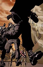
[Note: Cover shown here may or may not be from this year's books. Who knows?]
JOHNSTON: The flat colour thing with indies is... those covers generally do look better.
WHEELER: It's lazy, but effective.
JOHNSTON: I don't even think it's necessarily lazy. It's just that indie people are more inclined to think about how they can stand out from everybody else, and make it obvious that their book is not mainstream superhero.
 WATSON: They won't look distinctive in a store that racks all its independent
books in one rack.
WATSON: They won't look distinctive in a store that racks all its independent
books in one rack.
JOHNSTON: It's just that there's only so many pastel colours out there they can use. You've got to remember how many more comics come out every month than novels. It's only the same as having fifty comics that all feature a superhero punching another superhero on the cover. That's why, when you get something that stands out like POPGUN WAR, it's worth noting. Because it uses the same principles, but it's executed in a way that really does stand out.
WATSON: We really ought to mention Marvel covers at some point. To say that they all suck, apart from a few that were good.
WHEELER: Eloquently summed up. Thank you. Who was good?
 WATSON: Bradstreet. And your man Kaare Andrews.
WHEELER: On Bradstreet, I did write down in my notes before we started; "No walls". It seems to be the case this year that Tim Bradstreet has forgotten his men smoking, leaning against walls.
WATSON: Yeah, but he's still gone for backdrops with a single character in front of it.
WHEELER: Sometimes, but if you look at his HELLBLAZER covers for DC, there's a design element there. He's actually gone for something completely different. His PUNISHER covers have started to resemble his HELLBLAZER covers. He's fallen into a whole new, more exciting rut. He is a really lovely artist, but his men-against-walls covers had become so boring. Who else is good at Marvel? Quitely and Hitch have both been doing these portrait pictures, where every cover is one character, and it's actually quite a nice approach for superhero comics.
 JOHNSTON: Quitely's also done a few team covers, as well.
WHEELER: And he hasn't done all the covers this year. But Hitch has done all the covers for THE ULTIMATES. We have had a couple of those this year. And every one is a different character.
WATSON: I start to suspect they're just introducing new characters so he can keep doing covers.
JOHNSTON: Quitely's NEW X-MEN covers have stood out. I'll happily admit that when I get past the S's and T's in the store, I skim, because I know most of the books are going to be x-books, but Quitely's have always made me stop and go, ooh, that's nice.
WATSON: While we're in the X section: X-STATIX. They really aren't much more than a continuation of the art inside, but the art inside is very lovely and distinctive. There's this lovely kitsch feel; "In this issue, a team member dies!"
JOHNSTON: I wasn't sure about those covers. The composition didn't seem striking, other than that it's an Allred-drawn picture.
WHEELER: It's not all bad news at Marvel. We have come up with a few names. Alex Maleev I'm still very keen on. He's a great interior artist, and while his covers on DAREDEVIL are not going to leap off the shelves - they're very dark and they're not very descriptive, in the same way that the David Mack's covers have never been very descriptive - they are wonderful works of art.
WATSON: Scott Morse's ELEKTRA mini series, GLIMPSE & ECHO, I really liked that.


WHEELER: The Scott Morse ELEKTRA covers are bound to look nice when the competition is Greg Horn. Possibly the worst covers in the world. His PALE LITTLE SPIDER covers were an improvement on his other work.
WATSON: And when you say 'improvement', they only made me want to throw up, rather than throw up, then burn them.
 WHEELER: Kyle Hotz's HOOD covers, I liked. Udon did some quite original
covers for AGENT X and DEADPOOL. Daniel Zezelj's cover for CALL OF DUTY: THE
WAGON #2 was one of my favourite covers of the year.
WHEELER: Kyle Hotz's HOOD covers, I liked. Udon did some quite original
covers for AGENT X and DEADPOOL. Daniel Zezelj's cover for CALL OF DUTY: THE
WAGON #2 was one of my favourite covers of the year.
JOHNSTON: Daniel Zezelj I always like. Striking because of his art style, not necessarily because of the design. He did the CORINTHIAN mini series last year. Very black, thick, scratchy ink. I think he's a criminally under-used artist. He may disagree, he may be getting plenty of work.
WATSON: For saying that Marvel did badly, we've done quite well for picking out a lot of stuff.
WHEELER: Well, they put out a lot of books.
 JOHNSTON: I think the difference is, Marvel's covers stand or fall on
the strength of the actual individual artists and their styles, rather than on
whether or not the covers are well conceived or well designed. It's much more
down to the strengths and styles of the artists they pick. Oh, another one I
wanted to mention from flicking through Previews is DC's BIG DADDY DANGER. I'd
never even heard of that, but what a lovely cover. Are they all like that?
JOHNSTON: I think the difference is, Marvel's covers stand or fall on
the strength of the actual individual artists and their styles, rather than on
whether or not the covers are well conceived or well designed. It's much more
down to the strengths and styles of the artists they pick. Oh, another one I
wanted to mention from flicking through Previews is DC's BIG DADDY DANGER. I'd
never even heard of that, but what a lovely cover. Are they all like that?
WHEELER: Yeah. I'm a big fan of Adam Pollina's art, but the book itself was a letdown.
JOHNSTON: It's absolutely gorgeous. I can't believe I didn't notice that in the shop.
 WHEELER: I really liked the Leandro Fernandez covers for QUEEN &
COUNTRY, which is the first time I've been able to say that about that series.
I think, for a really strong book, it's had some really disappointing covers.
WHEELER: I really liked the Leandro Fernandez covers for QUEEN &
COUNTRY, which is the first time I've been able to say that about that series.
I think, for a really strong book, it's had some really disappointing covers.
WATSON: The thing I wanted to mention about QUEEN & COUNTRY is the hardcovers. I know they're not exactly covers in the conventional sense. It's just red with gold lettering. But they're gorgeous. I buy QUEEN & COUNTRY in hardcover because they look so good. Oh, we've entirely neglected to mention DARK KNIGHT 2, and we really ought to put the boot in at some point...
WHEELER: Go!
WATSON: It's horrid! Bad! Very bad! Stop!
WHEELER: And in the form of a sentence?
WATSON: That was almost a sentence.
JOHNSTON: I think the DK2 covers were exactly what you'd expect from the book, to be honest.
WATSON: To be fair, the first one, with the upraised fist, was at least reasonably striking. But then the colours went and pissed on it.
 JOHNSTON:
Was the second one the one with Superman and Wonder Woman kissing? That was
dreadful, I couldn't even work out what it was for at least a minute, until I
turned the picture around.
JOHNSTON:
Was the second one the one with Superman and Wonder Woman kissing? That was
dreadful, I couldn't even work out what it was for at least a minute, until I
turned the picture around.
WATSON: It was just awful. Ugly. I had to blot it from my memory.
JOHNSTON: I think it would have been far better to just go with no art. Everyone knew what it was. If it had just had, in big letters, DARK KNIGHT STRIKES AGAIN, there are very few people who hadn't already heard about the book, and everyone knew what they were going in to buy.
WHEELER: We can probably agree on DK2 as some of the worst covers of the year...
WATSON: Although Greg Horn is still out there.
WHEELER: But who were the best?
JOHNSTON: GLOBAL FREQUENCY? I've liked what I've seen so far. Different, unusual; it's an old and tried method, what Brian Wood's doing with the typography, but it's very striking, and it isn't a single colour.
 WATSON: The logo annoys me. "Are you on the GLOBAL FREQUENCY?" with the
tiny question mark. The tiny question mark really irks me.
WATSON: The logo annoys me. "Are you on the GLOBAL FREQUENCY?" with the
tiny question mark. The tiny question mark really irks me.
JOHNSTON: I don't think the covers would have the same impact without the small text. It makes it look like there's more on the cover than there actually is, and it gives you the impression that there is a lot more to read and a lot more to see than you're getting from a distance. It makes you go closer to the cover to read what the small words are, and the idea is, once they get you that close you're going to open the book.
WHEELER: My cover guy of the year is Kaare Andrews.
 JOHNSTON: More parody covers?
WHEELER: Well, not everything he does is a parody cover. He does do some really original CG covers. His HULK covers are mostly pastiche, but there's amazing diversity in evidence - and the guy clearly uses computers for most of his work. His APOCALYPSE NOW cover on HULK was very clever. The Kellogg's cereal cover, WHERE THE WILD THINGS ARE, Norman Rockwell - some very obvious targets, but some very esoteric ones, and every cover he does is striking. I think he's been a real discovery for Marvel, and their strongest cover artist.
JOHNSTON: How long do you think it will be before DC nabs him?
 WHEELER: I think he's going to Image next.
JOHNSTON: Dave Johnson. 100 BULLETS. I find myself a teensy bit disappointed, this year, because I can't think of any 100 BULLETS covers this year that made me go wow the way some of the ones did last year. I find it a little sad. The only one I can remember from this year is the close-up on Dizzy's eye.
WHEELER: OK, so is THE FILTH your choice for the year?
JOHNSTON: Yes. Designed by Carlos Segura. I still don't know whether Morrison's got any input, but I'd be really surprised if he doesn't, simply because they tie in to the content of the issue so much. I just think they're absolutely wonderful, as I expounded in my column. They are wonderful pieces of design - they're not necessarily massively innovative, but for comics they're so original, and so appropriate for the audience that Morrison is trying to go for, and they give back to Vertigo that sense of cultural awareness that they used to have ten years ago and have lost, to a certain extent.
 WATSON: My choice for the year is a bit general, here. I'm picking hardcovers
without dust jackets. The specific ones I'm thinking of are QUEEN & COUNTRY,
which I've already mentioned, and PROMETHEA. I took the PROMETHEA dust jackets
off the other day - I hate dust jackets, they drive me bananas.
WATSON: My choice for the year is a bit general, here. I'm picking hardcovers
without dust jackets. The specific ones I'm thinking of are QUEEN & COUNTRY,
which I've already mentioned, and PROMETHEA. I took the PROMETHEA dust jackets
off the other day - I hate dust jackets, they drive me bananas.
JOHNSTON: You mean the embossed elements?
WATSON: Yes. The PROMETHEA ones tie in beautifully to what the trade's about. The third trade, which is the first half of the tree of life, has got the tree of life embossed on the cover; the upper half is solid lines, the lower half dashed, and I'm sure the next trade will be the inversion of the same. I just took the dust jacket off and my jaw just dropped.
JOHNSTON: Would you have had the same reaction if they'd looked like that in the store?
WATSON: Yes.
JOHNSTON: Do you think many other people would have?
WATSON: If they didn't, they're philistines and should be shot.
JOHNSTON: There's no getting away from the fact that it's a commercial medium, and the covers have actually got to stand out on the shelf.
 WATSON: It's a gorgeous looking thing. OK, there's no logo on it, but if you stick
that face out on the shelf, people are going to see it. It'll look like nothing
else. You'd only have to open it to get the JH Williams art blasting in your
face.
WATSON: It's a gorgeous looking thing. OK, there's no logo on it, but if you stick
that face out on the shelf, people are going to see it. It'll look like nothing
else. You'd only have to open it to get the JH Williams art blasting in your
face.
WHEELER: You're just a whore for embossing.
WATSON: I want shiny things. The QUEEN & COUNTRY and PROMETHEA hardcovers are just lovely objects that I love having on my bookshelf.
WHEELER: So, 2002, any better, worse, or no different?
WATSON: A slow improvement, but it's very slow. Marvel has at least got in to the game with some nice covers now.
JOHNSTON: I think a general improvement across the board, and it's nice to see a few more covers taking typography seriously. But I can't think of anything that's made me think that it's all going to be great from here on. There's still a lot of work to do.
WHEELER: I think we saw some changes creeping in during 2001, and I think those trends have continued, but I don't think anything radical came out this year.
WATSON: Except for THE FILTH. If THE FILTH has any effect on comics, I really want to see more covers that look that modern.
JOHNSTON: But I really don't think that's going to happen.

This article is Ideological Freeware. The author grants permission for its reproduction and redistribution by private individuals on condition that the author and source of the article are clearly shown, no charge is made, and the whole article is reproduced intact, including this notice.
All contents
©2001-5