FEATURES
REVIEWS EDITORIALS
THINGS TO COME
ARTICLE 10

>> Triple A: Urban Legend
>> Letter from the Editors
More...

ANDREW WHEELER: Right, it's covers of the year 2003.
[Alasdair starts weeping.]
WHEELER: Don't cry when I'm talking. What we do, for those who don't know, because most people aren't with us in the room when we record it, is we go through all of the Previews for the calendar year to try to remind ourselves of the covers that we've enjoyed or endured during the past twelve months. And it's usually more endurance than enjoyment, I think it's fair to say. In the past two years, the people who have stood out have tended to be Dave Johnson, Tim Bradstreet...
ALASDAIR WATSON: John Cassaday.
ANTONY JOHNSTON: Tim Sale, Carlos Segura - the guy who does the FILTH covers. And we have mentioned Andi Watson once or twice.
WHEELER: How have those people fared this year? Anything to add to their reports?
WATSON: Well done. More of the same.
 JOHNSTON: They have pretty much kept on keeping on. Andi Watson, if anything, stepped his minimalism up a notch.
WHEELER: Can you step minimalism up?
JOHNSTON: Down, then. LOVE FIGHTS covers are remarkably minimalist, even for Watson, but they've really stood out on the shelves, and they are lovely pieces of design as well. He's probably the only one of those who has differed significantly.
WATSON: Bradstreet's expanded his range a bit, in terms of the backgrounds. There have been more backgrounds in his covers in the past twelve months than there had been previously. I think he was trending towards it at the end of last year.
JOHNSTON: He has now added to his repertoire of photographs of brick walls and skulls. I think his covers are better rendered now; they look a bit more painted, actually. Dave Johnson on 100 BULLETS continues to be consistently good. The trade covers have been very strong as well. I thought SIX FEET UNDER THE GUN was a beautiful cover.
WHEELER: Johnson's covers don't seem as striking now, though, simply because you're used to them.
 JOHNSTON: He never disappoints, but you're right, he doesn't stand out quite so much. I think that's just because of us. I think if you were to take someone who'd never seen a Dave Johnson cover before and show them one of his latest covers, they'd still be impressed.
WHEELER: But shouldn't he be keeping it fresh for the people who are adjusted to him?
WATSON: He's developed a style that they've used to market 100 BULLETS.
JOHNSTON: And Johnson has said himself that he's always tried to do something different, but at the same time, he paints how he paints.
WATSON: I think he's trying to improve on himself, but there's only so far he can do that on 100 BULLETS covers. What's he done besides 100 BULLETS covers?
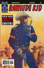 WHEELER: He turns up on a couple of Batman books. My favourite Dave Johnson cover of the year is actually his RAWHIDE KID #1 cover. It's a comic that I loathe, because, well, it's just an insult, but the cover to issue one with him blowing a gun and holding another gun to his crotch, it's not typical Dave Johnson because it's not so much about the design, but there's great humour to it, and it's very nice, stylistically.
JOHNSTON: I didn't even recognise the style as being his.
WATSON: See? The man does have range!
WHEELER: Brian Bolland is someone else who I think has become invisible through his own consistency.
JOHNSTON: Kind of. In that you expect to see a Batman Bolland cover.
WHEELER: And looking through those Previews catalogues, they didn't stand out this year. The previous two years, they've stood out.
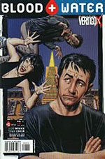 JOHNSTON: The only one that did for me was the cover to issue one of BLOOD + WATER, but that may be just because it was printed almost full size. And that was a bit more going back to the stuff he was doing on THE INVISIBLES. It was a more fun Bolland cover than his generally quite dour superhero stuff.
WATSON: While there were many, many covers that were dreadful, when it comes to good covers I think there were more of them, so maybe Bolland and Johnson don't stand out because they're just 'another reasonably good cover'?
WHEELER: Did you think the overall standard was better?
WATSON: I think the standard of good covers was better, and I think from Marvel and DC there were more covers that I thought, 'that's alright', or at the very least, 'that's not offensively bad'. Which, for comics, is pretty good going.
JOHNSTON: I'd agree with that. I think the general level has got a little better, as it did last year, and we said this last year. I think it's a bit of a snowball effect. The more people who put out good covers, the more other people see them and go 'we should do something like that'.
WATSON: I think Marvel and DC have improved, I'm not sure anyone else has.
JOHNSTON: There are plenty of indie publishers doing good covers.
WATSON: But there are many many more of them doing godawful pieces of shit.
JOHNSTON: Yes, but that's just a numbers thing. There are many more indie publishers than Big Four. There is an awful lot of tripe in there, but that's no less true of the mainstream stuff. By proportion, I think there's just as much.
WATSON: I actually think there are more bad covers in the indie section. There are some indie books I thought had nice covers, and some that had the standard indie cover of slightly muddy pastel colours...
JOHNSTON: But a lot of those are nice covers.
WATSON: I've got to the point now where they don't stand out. I see another indie book with slightly muddy pastel covers and I don't stop to look at it. It's not doing its job. Surely there has to come a point where they say 'we've done this now, it's time to try something new'?
WHEELER: So what did grab your eye this year?
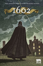 JOHNSTON: 1602. Scott McKowen.
WATSON: Yes, I love that woodcut effect. I thought that was fantastic.
JOHNSTON: It was a remarkably understated style for a publisher like Marvel. You can imagine only somebody like Gaiman could get away with demanding covers like that, really.
WHEELER: Well, it's these prestige limited series that Marvel has been doing lately - I don't know if they'll carry on doing them after the regime-change. There was also BORN, the Garth Ennis Punisher series that had cardstock covers by a guy named Wieslaw Walkuski, who, like Scott McKowen, I've never heard of, but he provided a theme to his covers, these crumbling faces. Very striking.
JOHNSTON: I think McKowen is a magazine illustrator. I remember hearing that when he was announced.
WHEELER: So the same could be true of Wieslaw Walkuski.
JOHNSTON: Crazy name, crazy guy.
WHEELER: DC are the people we've said for the past year have had the best cover artists. This year, has that been true again? They still have the same cover artists. Johnson, Bolland, Phil Noto...
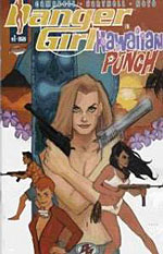 JOHNSTON: Who did the DANGER GIRL: HAWAIIAN PUNCH cover, which, for a DANGER GIRL cover, was remarkably understated and well designed, unlike the majority of J Scott Campbell's covers. Campbell's art is perfect for the interiors, but I don't think he's got an acute sense of design, and I think Noto clearly has.
WHEELER: Darwyn Cooke also does some very interesting stuff.
JOHNSTON: Hasn't he done the recent covers for Ed Brubaker's CATWOMAN series?
WHEELER: Originally, but this year it would have been Cameron Stewart and Javier Pulido. But the covers have all been good on CATWOMAN, whoever's doing the art.
JOHNSTON: It was. It changed last month. I think it's Paul Gulacy now, and a few people have expressed dissatisfaction at this. I think Noto is very good, he should do more covers.
WHEELER: He gets around. I don't think he's DC exclusive. Maybe he is. You go to sleep for half an hour and another one gets signed up.
WATSON: They'll take over the comic industry just by preventing the competition from hiring any talent.
WHEELER: What about DC's WildStorm line?
WATSON: GLOBAL FREQUENCY's covers were nice.
 JOHNSTON: Yes, those were good. They, again, lost impact after a while because after the first three or four months you realised they were all going to look like this, but they were very nice, and initially very striking.
WHEELER: Were they tied to the content at all?
WATSON: Loosely. The one in San Francisco had the Golden Gate Bridge on it.
JOHNSTON: The Le Parkour one had a blacked-out silhouette with a tiny figure leaping between two buildings. The one in the Norwegian church had a snowscape.
WHEELER: There was one in a Norwegian church?
JOHNSTON: Yeah, with the bell that summoned the dead, or something.
WHEELER: That sounds like Warren Ellis.
WATSON: That was actually quite good, that one.
JOHNSTON: It was, it was one of the better ones.
WHEELER: There's also WILDCATS 3.0 and SLEEPER. Sean Phillips, painted.
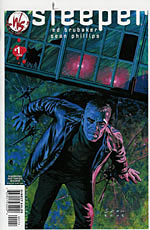 JOHNSTON: WILDCATS was very good. SLEEPER, possibly digitally painted, but painted none the less. I like those because they really stood out, and I think Phillips has a very good sense of design, you can tell that from his page layouts, and it translates to good covers. His cover to SLEEPER #1 was enough to make me take interest.
WHEELER: What covers has Sean Phillips done before?
WATSON: HELLBLAZER.
WHEELER: Ah, that's right. I like him as an interior artist, but I forget how good he is at covers. One of the newest talents I noticed at DC was James Jean, who does the FABLES covers. Very lovely, very different. Lots of curlicues and strange women. I'm not sure how to describe them.
JOHNSTON: Do you think they're all that different, really? They're pretty to look at, but they never struck me as that unusual.
WHEELER: I think the colouring is very different. There's a mellowness to the line work, as well.
WATSON: They're softer. You get more out of the covers the more you look at them.
WHEELER: And there's influences of art nouveau in there without it looking like a pastiche of someone like Mucha, which is something I got so sick of last year. I love Alphonse Mucha, but I don't want to see a thousand WONDER WOMAN covers all paying homage to him.
WATSON: James Jean takes the influence and makes it his own.
JOHNSTON: I see your point. There are very few solid blacks in his covers, and the colours do tend to be muted, which is nice and unusual, you're right.
 WHEELER: Christine Norrie, I think her cover to CHEAT was beautiful, and also her covers to HOPELESS SAVAGES, the black and white figure against a painted background, those are very eye-catching covers. Though it would be nice if the comic came out a bit more often.
JOHNSTON: She's having a baby, you callous, heartless, non-breeding person!
WHEELER: Christine Norrie doesn't need a child! She's married to a comics editor! That must be enough hard work. Norrie, I think, is Oni's best cover artist. I'm often disappointed by Oni covers. Scott Morse is the only other person I can think of who does particularly good covers for Oni. Actually, Jason Alexander's covers for QUEEN & COUNTRY were great. The painted cover of the couple in the hotel room, that was beautiful.
JOHNSTON: I may be biased, but I think you're being unfair on Oni, I think the do very good covers. The ARGOBOTS covers by Mike Norton, even though the comic wasn't for me, I thought they stood out.
WATSON: One cover that stood out, talking about Greg Rucka books, was the first cover of his WONDER WOMAN run, with the jet fighter pilot.
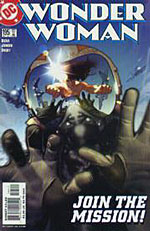 WHEELER: That was a Hughes cover, wasn't it? Hughes is actually coming off WONDER WOMAN to be replaced by JG Jones, but I think it's Hughes all this year.
JOHNSTON: I like Hughes, actually. He gets quite a bit of stick.
WHEELER: I do, too. I think he was a good WONDER WOMAN artist.
JOHNSTON: I thought he just suited the book, and he had a bit of an Alphonse Mucha thing going on, but not to a massive extent.
WHEELER: He did decent cheesecake. People underrate the value of decent cheesecake.
WATSON: I've never underrated decent cheesecake in my life.
WHEELER: I'm talking about the art style, Alasdair.
WATSON: Give me those pies.
WHEELER: I wish Steven Griffin's HAWAIIAN DICK covers were better. The interiors were great, but I felt the covers lacked cohesiveness. Too many elements flung together.
JOHNSTON: I think the cover to the trade was better than the covers to the series, and I'd put that down to his just learning as he went along.
WHEELER: I suppose that's fair. Who else deserves a mention?
JOHNSTON: Cliff Chiang. BEWARE THE CREEPER.
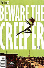 WHEELER: The BEWARE THE CREEPER covers looked better in Previews than they did on the shelf, because they would whack a huge logo on them. Issue one, she's leaping against a bright green sky, and in the shop that was mostly white because of the logo. It's not anywhere near as effective.
JOHNSTON: But they were nice cover art.
WHEELER: David Mack. While there was a bit of that fourteen-year-old girl's diary element to all his covers, his stuff for 'Purple', the final ALIAS story, was particularly good. Jessica reclining on top of a comics panel with her leg dangling and changing art style inside the panel. I think Mack is one of the better cover artists.
JOHNSTON: He doesn't do a lot for me. I understand he's popular.
WHEELER: We mentioned Cassaday before. In addition to doing PLANETARY covers - occasionally - he's been doing ULTIMATE SIX and CAPTAIN AMERICA covers.
WATSON: Those CAPTAIN AMERICA covers were lovely. I've no idea if the comics were any good, but the covers were nice. I wouldn't buy CAPTAIN AMERICA if you paid me.
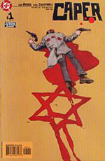 JOHNSTON: Tomer Hanuka, the BIPOLAR covers. He's got a very good compositional sense. Not design so much as his sense of composing a picture. It's just very, very good. He's got such a striking art style that it really doesn't look like anyone else. By the same token, Farel Dalrymple, who is doing the art for CAPER, the new Judd Winick series, and also did the art for POP GUN WAR, which had lovely covers. He and Hanuka are two of the up-and-coming young artists to watch for covers, because they both have a very offbeat attitude to composition. They do stand out.
WATSON: The LOSERS covers by Jock are very different. He has a name that makes him sound Scottish. Is he Scottish?
JOHNSTON: No, he's from Somerset.
[Editor's correct: Jock actually lives in Devon, and was in fact born in Scotland.]
WATSON: I didn't think he was. His covers don't look like anything else. The only person I can compare him to is Dave Johnson, and even then they're quite different. The Statue of Liberty cover he did, with the silhouette, it had a weird blue texture to it, a metal effect, and that against the white space around it, it was very striking. Again, it looked better in Previews, because they then stuck a logo on it.
WHEELER: Though the LOSERS logo is one they've done some interesting stuff with, to keep it consistent with the design.
JOHNSTON: One of the things that appeals most about Jock's covers is the sense of movement, dynamics, about them, which has a lot to do with the way he draws. I do wonder how much that has to do with his 'training', for want of a better word, on 2000AD, where they're very much about the kinetic style. But it's a style he's made his own. I agree, his covers are very distinctive.
 WHEELER: I think they're some of the best and most impressive new covers we've seen. There's a great consistency without it settling into any kind of rhythm. Excellent use of colour, especially for Vertigo, where you're used to them being dour and down and goth-friendly.
JOHNSTON: Though there is a lot of brown and orange in Jock's covers.
WHEELER: I suppose there is. While his art reminds me of a few other artists, his covers are quite different. He's definitely one of the best emerging cover artists of the year. Even if he's not Scottish.
WATSON: The big fraud.
WHEELER: Sienkiewicz did some good covers on ELEKTRA, though the comic was terrible. He's always reliable. Essad Ribic on WOLVERINE was quite good. Oh, and Josh Middleton, on NYX.
WATSON: I bumped into an old friend at a bar...
WHEELER: Where is this story going, we ask ourselves.
WATSON: A guy I haven't seen in years, who used to be into comics. I bumped into him in a bar, and one of the first things he said to me was, 'Have you seen Josh Middleton's work on NYX? Those covers are marvellous.'
WHEELER: Yes, his covers are marvellous. Do you think his covers are marvellous?
JOHNSTON: Mmm... yes.
WHEELER: You'll say anything so as not to be drawn into an argument on the subject. If only that were always true. OK, let's talk about people we hate. Starting with nostalgia comics.
WATSON: Fucking 80s retro-revivals of TRANSFORMERS and THUNDERCATS and GI JOE...
WHEELER: We know you hate the comics...
JOHNSTON: We're talking about the covers.
WATSON: And they're shit too! They're far too busy. Just bright colours and flash and dazzle. The TRANSFORMERS covers are particular sinners, they really are. They've got that godawful colouring inside that makes everything look shiny and liquidy, and they stick it inside as well, and it's just hideous to look at. It's garish; the covers are cluttered.
JOHNSTON: They are both bland and over-busy.
WHEELER: The TRANSFORMERS covers remind me of what a car looks like after it's come out of a compactor. Just stick a TRANSFORMERS logo on top.
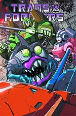 JOHNSTON: I think there's a tendency with nostalgia comics to make covers that feature as many of the characters as possible, because everyone has their own favourite. TRANSFORMERS fans all have their favourite Transformer. THUNDERCATS fans all have their favourite Thundercat.
WHEELER: Tygra! Yes.
JOHNSTON: I thought you'd be more a Panthro man.
WHEELER: Oh no, it's the unitards for me, all the way.
JOHNSTON: If you have a cover and it doesn't include somebody's favourite, there is a risk that they won't pick it up. I think they produce variant covers as well. I'm not saying this excuses the bad design of the covers, but I do think there's a reason for it.
WHEELER: Actually, it's true that I picked a copy of THUNDERCATS off the shelf, because they drew a very good Tygra...
WATSON: Get out!
WHEELER: Leave me alone! I didn't pay any money! There was a very nice Tygra on the cover, and I flicked through it, and he wasn't in the issue at all! So, back on the shelf it went. So you're right, they stick whoever on the cover. That is proven by my singular experience.
JOHNSTON: Your singular empirical experience, yes.
WATSON: Shit and evil. Someone stop these comics.
WHEELER: I don't think we can. I think they'll stop themselves. OK, nostalgia has been big business, of course, which is why we can't stop them. The other area that's been a big success in the industry has been manga, and similarly, that suffers from...
WATSON: Shit Covers Syndrome.
WHEELER: Is that what we're calling it?
WATSON: Yes. Where there are a few good covers, and the rest are appalling.
WHEELER: Manga seems to have a terrifically low hit rate. Or maybe it has the same hit rate and we just judge it harsher.
WATSON: One of the things I was wondering is, would those covers sell in Japan? Is it that these comics sell silly numbers in Japan, and we get them over here and the publishers say, 'don't touch a good thing, boys'?
WHEELER: Do they sell well in Japan, Antony? I ask you, because... because you're shorter than me, and therefore more Japanese.
JOHNSTON: Manga does sell well in Japan, or so I've heard.
WHEELER: Do you think it's a different design sense? That those covers are considered all right in Japan?
 JOHNSTON: The Japanese have a very different design sense to the British and the Americans, in general. I think you only have to look at any kind of Japanese branding to recognise that. They love busyness, even more so than we do. I don't know for sure if they use the same covers over here as in Japan, but I would assume they probably do, because they are trying to be authentic, especially people like TokyoPop or Viz. They're trying to push the authentic experience.
WHEELER: Viz were the ones that first caught my eye, going through. I got to the Viz section and thought, wow, this is bad.
JOHNSTON: They have done some very nice covers.
WHEELER: A couple. The BATTLE ROYALE cover was nice. But actually, Viz don't deserve to be singled out, because when I looked at the other manga sections, they were all bad, including TokyoPop, who you suggested might be better.
JOHNSTON: I think they're generally better. I think they have more of a hit rate than some of the others, but there's no denying they still have some badly designed covers. But they have the advantage of at least having a consistent trade dress, which Viz and ComicsOne don't seem to have.
WHEELER: What's interesting is that we've had all these comics trying to emulate manga, from Marvel and publishers like that, and while they can't do it and the comics tend to be pretty bad, the covers are often better by quite some distance. Steve Uy's covers, I think, are quite decent.
JOHNSTON: But is that because they're better by our standards?
WATSON: Well, yes. But what other standards do we have to judge by?
JOHNSTON: But if they're trying to be like manga, aren't they failing in that?
WATSON: They're trying to develop this American manga, they're not trying to do straight manga.
WHEELER: They're applying a different design sense. Even the Kia Asimaya covers for UNCANNY X-MEN were more Western in their design. They tended to feature a single, solitary character. They were awful covers, I don't know why this guy is considered a legend...
JOHNSTON: Wasn't that true of WOLVERINE: SNIKT, as well? Single image?
WHEELER: Yes. Which I think is emblematic of a more design-centred approach. And that's what we seem to do. By 'we', I mean 'here in the West'. 'We' as a hemisphere... we tend to take these manga artists and make them do Western-style covers. And I think it's better. The comics are terrible, but the covers are better.
JOHNSTON: I would agree, but I do wonder if it's simply because we're Westerners.
WHEELER: But that's who they're trying to sell it to.
JOHNSTON: True, they're not trying to sell them back to the Japanese.
 WHEELER: I must also qualify all this by mentioning X-MEN: PHOENIX. I don't know the ethnicity of the artist...
WATSON: Are we sure they're human?
JOHNSTON: The woman with the smallest pudenda known to human kind.
WHEELER: Did you like those covers, Alasdair?
WATSON: No! They weren't even good porn!
WHEELER: They were freaky. Brazilian waxing all the way.
JOHNSTON: Waxing and Polyfilla, frankly. That first one was angled from somewhere around her knees, yet there was still only the barest triangle of material on the end of this thong. You're wondering, well, where exactly does the opening start?
WATSON: Antony's so classy.
WHEELER: This is why he writes porn comics.
JOHNSTON: One has to bear these things in mind, you know.
WHEELER: While we're talking about Avatar, I must say, I don't like your publisher's covers, so there.
JOHNSTON: Well, not on my books, so get off.
WHEELER: Juan Jose Ryp has done covers for you, hasn't he? Juan Jose Ryp has no depth perception. I don't like that.
WATSON: Is he blind in one eye?
 JOHNSTON: It's not that he has no depth perception, it's that he doesn't vary his line weight.
WHEELER: Yeah, well. I choose to say it's because he's crippled. It's the only possible explanation. Avatar covers tend to be too busy. They also tend to feature large bosomed women doing ridiculous things, which is something else that doesn't appeal to me.
JOHNSTON: That's not necessarily true of all their books. DICKS, you could never accuse of being softcore porn, could you?
WATSON: Ew.
WHEELER: Antony, you wanted to talk about comics emulating film posters?
JOHNSTON: Oh, yes. There seems to be an increasing trend - and it's going in the right direction, it's well intentioned, but failing - for comic artists to emulate the style of film posters. I don't mean literally ripping off film posters, but trying to emulate the 'three big heads' style of film poster, or the 'five men stood at the back with one at the front'. They're very good compositions, which is why they're used over and over again. However, they make them messy by putting too much detail into the pictures, or too much background, or the colouring isn't right. When comic guys try to do it, they just go a little too far. Maybe they don't feel confident having just two characters and no background.
WHEELER: Are there particular covers you're thinking of?
JOHNSTON: No, I can't really name any examples. It's just something I've noticed on the racks. Have a look, it's mostly Marvel and DC comics that are doing it. They're clearly trying to get over some kind of cinematic style, but they'll have the usual Marvel New York skyline in the background, or something. Less is more, and more comic artists can learn from that.
WHEELER: So, we reach the end of another year, and another twelve months of diabolical covers. Who are we picking as our names for the year?
JOHNSTON: Ooh, HOW LOATHSOME.
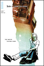 WHEELER: Yes, those have been gorgeous. These lovely slices of colour, depicting the local colour, the scene, the city, and then a character outside of the strip of colour. Really nice style, four covers fitting the same style. You get a good sense of the book and a good sense of what these characters are like; the covers do a great job of evoking their personalities.
JOHNSTON: I believe they were half photo, half illustration, weren't they? The strips of colour are actually photographs. Yes, Naifeh gives good cover.
WHEELER: We would also call Jock one of our heroes of the year. Who else would we add to that number?
JOHNSTON: I'd like to add Farel Dalrymple, but maybe next year. I think he needs a few months to get into the groove.
WHEELER: He's got to prove his love to you?
WATSON: I knew that was coming.
JOHNSTON: Not because he needs to improve as an artist, necessarily, but because he needs to find more of a voice on covers, specifically.
WHEELER: I was disappointed not to notice Kaare Andrews this year. I don't know what happened to him. He must be playing video games. He was my favourite last year. His WHERE THE WILD THINGS ARE cover for HULK was this year, and that was brilliant, but that was the tail end of his HULK run. I don't know what's happened to him. Alasdair?
WATSON: There was no-one who I thought stood out who wasn't mentioned in previous years. I think I pick Andi Watson every year as my favourite cover artist. The LOVE FIGHTS covers are the only ones that really stood out for me. I missed most of the news about LOVE FIGHTS, then I saw it on the shelf and thought, that's an Andi Watson cover, I'll have that.
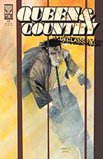 JOHNSTON: I would also nominate Scott Morse as a hero of the year, because of his DECLASSIFIED covers, and this new SOULWIND hardback. His covers are not only very good, but they shake up the usual fare.
WHEELER: We haven't mentioned Greg Horn this year.
JOHNSTON: There's nothing more to say.
WHEELER: So, Alasdair, you do think things were better this year?
WATSON: I think Marvel and DC are better, but not in any particularly stand-out way. I just think the standard is higher. We've said this every year.
WHEELER: I'm not sure it has improved. I don't know what you two are seeing.
WATSON: I think the average level of composition has got better. I'm not saying that there are any covers that particularly stood out, but I think that's partly because even if the covers are uninteresting, they're better composed and laid out. If you look at Future Comics and nostalgia comics, they make my point. The nostalgia comics are just too busy, and Future Comics, they're deliberately trying to produce comics in this 70s mode, and the covers are appalling, but they're exactly what you'd expect to see on comics of that sort, even as recently as the early 90s.
WHEELER: And that's what we're moving away from?
WATSON: Yeah. We're not looking at loads and loads of really good covers, we're looking at a move away from these dreadful, vile pieces of shit...
JOHNSTON: I'd agree, I don't think the top end has necessarily got much better, but the general overall level has got better. And there will always be shit covers, regardless. There will always be plenty of them. But just like last year, the overall standard has improved. And I hope that continues.
WHEELER: Well, we'll find out in a year.
JOHNSTON: See you then!
WATSON: Oh God, do we have to do this again?

This article is Ideological Freeware. The author grants permission for its reproduction and redistribution by private individuals on condition that the author and source of the article are clearly shown, no charge is made, and the whole article is reproduced intact, including this notice.
All contents
©2001-5