FEATURES
REVIEWS EDITORIALS
THINGS TO COME
ARTICLE 10

>> Top Nine: Yusuf's Choice
>> Alphabetti Fumetti: S is for Shooter
More...

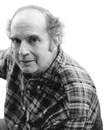
P is for Parobeck, Mike
b: 1965, Ohio; d: 1996, Florida
1993: BATMAN ADVENTURES
In the early 90s there was only one Batman comic worth reading, and that was BATMAN ADVENTURES. Spinning off from the cartoon show, it regularly offered single-issue stories of dynamic action and fluid storytelling while perfectly capturing the spirit of the Dark Knight Detective. If there was any single comic that was capable of expanding its reach and bringing new readers into the fold, this was it.
Mike Parobeck was the artist of the series, and he was exceptional. His style was notable for the simple but striking layouts and the attractive characters drawn with a clean line. He was like the bastard child of John Byrne and Jaime Hernandez, but with a smidgeon of DNA from Alex Toth. His approach to drawing was distinctly out of step with the more convoluted cross-hatching and bulging musculature of his contemporaries, but it was this lack of conformity to the prevailing trends that made his art so eye-catching.
According to his friends, Parobeck was a self-depreciating and anxious fellow; he worked on two short-lived series, EL DIABLO and THE FLY, and he took it personally when they were cancelled. It wasn't until BATMAN ADVENTURES that he found his niche, and worked on the series for an unbroken until his premature death from complications arising from diabetes. It was a great loss. If Parobeck were alive today he would have seen his influence manifest itself in artists as popular and diverse as Mike Wieringo, Ed McGuinness and Michael Avon Oeming.
In a recent tribute, Mark Waid stated; "There are very, very few comics creators whose actual body of work is surprisingly small in comparison to their influence on those who came after them. Art Adams is one; Steranko is another. That's a good group to be in."
Amen to that, Mr Waid.
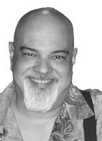
P is for Pekar, Harvey
b: 1939, Cleveland, Ohio
1976: AMERICAN SPLENDOR 1994: OUR CANCER YEAR 2005: THE QUITTER
 Many works of art and entertainment have used the word 'American' in their title; it's a signal they have something to say about the state of the nation. Two recent examples are AMERICAN BEAUTY and AMERICAN PIE, one an Oscar-laden satire on suburbia, the other a comedy about the teenage preoccupation with sex. AMERICAN SPLENDOR is one of comics' best known examples, featuring downbeat (but somehow uplifting) tales of working-class life from the streets of Cleveland.
What's exceptional about this series is that it's been independently financed and published for the better part of three decades, driven by a fierce desire for self-expression by writer Harvey Pekar. Inspired by his friend Robert Crumb, Pekar anticipated that the medium of comics could be used for so much more than superhero power fantasies and escapist fiction. It could be used to chronicle the trials and trivialities of one man's life. Pekar set about writing scripts and cajoling a number of artists to draw them (Crumb included). Waiting in line in a super-market, washing dishes, starting a car in winter - nothing was considered too minor to be the subject of a story.
As his reputation grew, Pekar had several brushes with fame. In the late 80s he was a regular guest on LATE NIGHT WITH DAVID LETTERMAN, where the audience were frequently invited to laugh at him rather than with him. Pekar was content to go along with the ride, but after he attempted to engage Letterman in a serious political debate about the show's sponsors he was promptly ejected and banned as a guest until the early 90s.
When Pekar was diagnosed with cancer in 1990, he already had a coping mechanism for this shattering development - his comics. Together with third wife Joyce Brabner and artist Frank Stack he documented his treatment and recovery over the course of twelve months, resulting in the 224-page graphic novel OUR CANCER YEAR. It won several national book awards, and this tumultuous period ended on a positive note of family unity; Harvey and Joyce adopted the Stacks' daughter as their own.
In 2003 AMERICAN SPLENDOR was adapted into a film starring Paul Giamatti as Pekar and Hope Davis as Joyce. It was a funny and bittersweet movie that deservedly won the Grand Jury Prize at the Sundance Film Festival. Paul Giamatti's performance in particular was uncanny, and a worthy addition to the legion of artistic renditions of Harvey Pekar that had already featured in the comics.
Signalling a shift from independent publishing to the mainstream, Vertigo comics has released an autobiographical hardcover called THE QUITTER, with art by Dean Haspiel, which covers Pekar's early days of misspent youth. This summer Vertigo will also be publishing a five-part AMERICAN SPLENDOR miniseries, containing all new material from Pekar and his collaborators.
It's been a long slow journey to critical adulation and popular acceptance, but in the process, inadvertently or otherwise, Pekar has inducted himself into the pantheon of enduring comic book icons, a malodorous plebeian with bug-eyes and a comb-over (as he is frequently drawn) standing shoulder to shoulder with the likes of Superman and Batman.
P is for Perez, George
b: 1965, New York City, New York
1980: THE NEW TEEN TITANS; 1985: CRISIS ON INFINITE EARTHS; 1987: WONDER
WOMAN; 1998: THE AVENGERS
 Perez isn't exactly my cup of Darjeeling, but he's got a great many admirers. Alongside John Byrne he was one of the greatest superhero artists of the 80s, but unlike Byrne he continues to be popular and regularly works on high-profile projects.
My problem with his art is that it's so cluttered. Every page and panel is packed with detail. I can admire the patience and dedication that goes into drawing such large superhero scenes, but I find reading them a chore because the figures are so tiny and their features so difficult to distinguish. The eye doesn't so much flow across the page as a slow to a crawl and signal to the brain about a traffic jam.
Perhaps he'd be better suited to drawing frescoes on the ceiling of the Sistine Chapel. Religious art isn't short of any epic subject matter, and at least then Perez would have a bigger canvas to work on. Then again, he's probably done all that he set out to do in his current field. Different strokes for different folks, I guess.

This article is Ideological Freeware. The author grants permission for its reproduction and redistribution by private individuals on condition that the author and source of the article are clearly shown, no charge is made, and the whole article is reproduced intact, including this notice.
All contents
©2001-5